Pop Art As a Form of Visual Communication
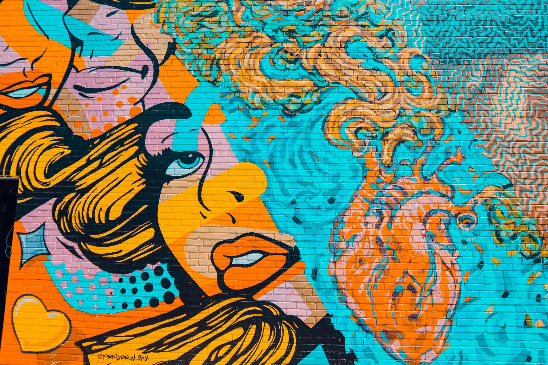
What is Pop Art? – Pop Art is a highly famous form of art that began in the 1950s. It is an art movement that’s created in the form of graphic art. It takes inspiration from existing icons such as advertising, comic strips, celebrities etc. This piece of writing will explore the ideals and beliefs behind the art movement, look at well-known pop artists as well as the techniques and visual characteristics of their artwork. It will also discuss what other movements that came to inspire Pop Art, as well at the legacy of this movement. History – Pop Art emerged in the mid-1950s in Britain, but didn’t arise in America until the late 1950s. The 1950s was a time when the Great Depression and World War II had ended. It was a time when television was introduced in American households, and when John F. Kennedy was elected for president.
So of course, many families across America were exposed to infamous amounts of advertising. And thus, Pop Art was created. Pop Art wanted to expand on the ideas expressed by Abstract Expressionism and challenge the traditions of fine arts. It takes inspiration from the art movement Dada, due to its utilization of found objects. The Pop Art style can be easily recognised by its bright, bold colours, thick defined line work, and some kind of iconic element used as the main subject. Some Pop Art uses repetition as well as variations of colour palettes used on the same object. It has become one of the many art movements that are still evident in today’s work, mainly showing up in graphic design.
Ideals and Beliefs – Pop Art was not an art movement in terms of a distinctly defined group. There were no organisations, no focused groups, no manifestoes or unitary calls for a particular orientation towards art. All there existed, was a small collection of individuals working independently, creating their own interpretation of Pop Art. A reason why Pop Art was widely popular in America, was because of what was happening in that point of time, and how the people transformed into a whole new generation. It was a time when the fine arts was widely popular, so artists wanted to create a whole new form of art that challenged the characteristics of fine arts. They used advertising and pop culture as their main inspiration, particularly famous icons. Pop Art really wanted to create a controversial message, much like the art movement Dada.
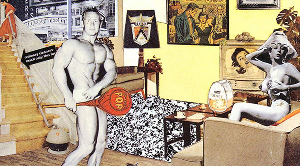
Dada Influence – The main influence Pop Art used to create their artworks was Dada. Dada was a European art movement that emerged in the 1910s. Dada was created out of negative reactions to the horrors of World War I. It involved cluttered images thrown together, like a disorganised collage, to convey a message, mainly about World War I. A popular artist to take inspiration from the Dada movement was Richard Hamilton. He was one of the earliest English pop artists. The art piece shown is called ‘Just What Is It That Makes Today’s Homes So Different, So Appealing?’. It’s a collage created in 1956 for the catalogue of the exhibition ‘This is Tomorrow” in London, England. It is a collection of images taken from different resources and placed into a single art piece. It depicts a man and a woman in a household. The man is interpreted as the dominant person by his body language and revealing his big muscular body, and large ‘tootsie pop’. The woman is interpreted as a sex object judging by her outfit and body language. The artwork has a very minimal colour palette, so it mostly relies on the iconic elements of the design to create the message. Although photographs have been used, it is a highly unrealistic and fictionist design due to the arrangement and placement of elements. Dada was the movement that sparked and kicked off the Pop Art movement.
Andy Warhol – Andy Warhol was an American artist and was one of the most influential and famous Pop artists of all time. His art was created using many forms of art techniques including hand drawing, painting, printmaking, photography and silk screening. Two of his famous artworks were ‘Campbell’s Soup Cans’ and ‘Marilyn Diptych’. They both represent a repetitive pattern of a particular symbolic item.
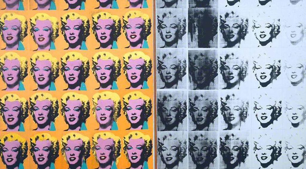
Marilyn Diptych – This art piece was completed after Marilyn Monroe’s death in August 1962. It has a total of 50 portraits of Marilyn Monroe. Half are coloured and half are black and white. People have assumed that Warhol used this colour method to symbolize Marilyn in life and death; life being the coloured side, and death being the black and white side. It was based off a photograph of the celebrity; however, this piece was created using acrylic on a canvas and the silk screen technique to create almost exact replicas of the portrait. The colours used are highly bold and bright, and very limited. The line work is minimal in terms of detail, only sing black paint to replicate the shading. Overall, this artpiece was one of the many artworks that were highly successful in communicating the art movement.
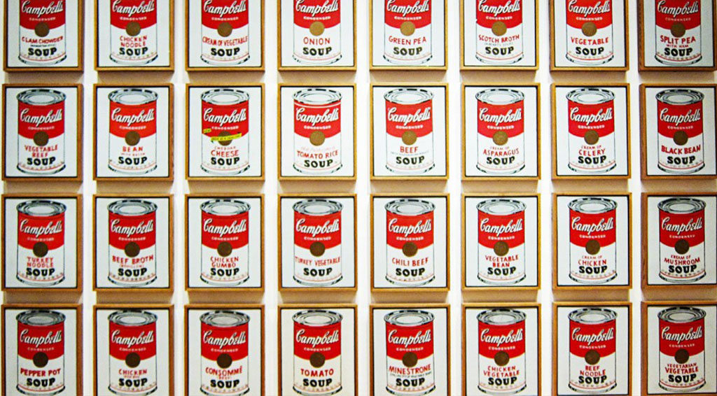
Campbell’s Soup Cans – This artpiece was completed in 1962. It has a total of 32 canvases, each with a painting of a Campbell’s Soup can, with a different flavour printed on the front. It was based purely from the product itself, keeping the original form. The colour palette is quite basic, using bold red to stand out as well as keep the integrity of the company. This art piece was most likely painted on canvas, and the silk screening technique to create almost exact replicas of the product. The line work is again minimal, only defining crucial parts of the design with no shading or highlights at all, making the design look flat. Overall, this art piece was one of the many artworks that was highly successful in communicating the art movement.
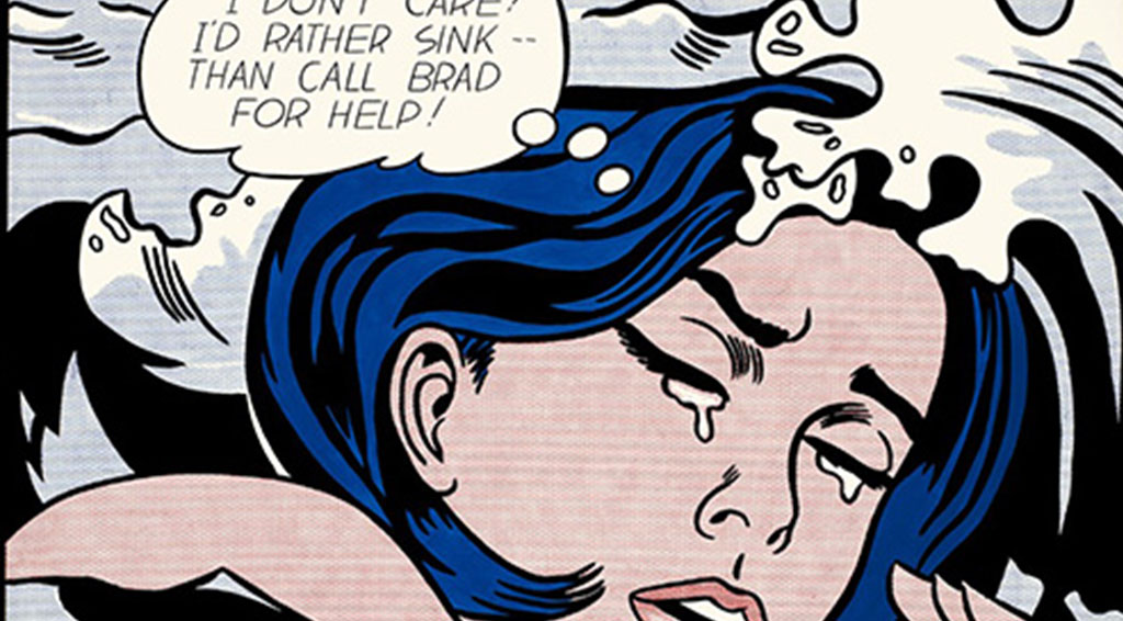
Roy Lichtenstein – Drowning Girl – Roy Lichtenstein was an American pop artist who, alongside Andy Warhol, was a highly leading figure in the new art movement. He takes inspiration from existing comic strips, and gives it a humorous touch, almost like a parody. One of his most famous artworks is called ‘Drowning Girl’, created in 1963. It features an illustration of a woman trapped in water, with a speech bubble of her saying ‘I don’t care! I’d rather sink – than call Brad for help’. The cropping of the design is very tight, only revealing a small part of the character, creating a sense of claustrophobia. He uses a particular technique using small dots of bright coloured paint to fill the art with colour. The line work is thick, only defining crucial parts of the design, with almost no shading or highlights. Overall, this art piece was one of the many artworks that was successful in communicating the art movement.
Legacy – Pop Art is still evident in today’s art, particularly in graphic design. One of the most well-known art works is called ‘Hope’, created in 2008 by Shepard Fairey. It’s a poster of Barack Obama and was iconic at the time due to the election in America. It’s stylized in the same way as pop art in terms of the stencil technique and colour palette. Another example is a music video called ‘Shot Me Down’ by David Guetta, a famous DJ. The style of the music video is highly influenced by Pop Art, in terms of the style of illustration, technique and colour palette. There are many types of media that still incorporate the elements that are evident in the original Pop Art.
Conclusion – Pop Art is a British and American art movement that began in the late 1950s. It was created using hand drawings, paint, photography and silk screening. This piece of writing discussed the ideals and beliefs of the movement, explored the visual characteristics and technical processes of Warhol’s artwork. It also explained the Dada influence that was highly evident in Hamilton’s work, as well as the legacy of the movement. Pop Art is still evident even today, so the movement never died off; it still lived on.

