// ANNUAL REPORT DESIGN REBOOT
CLIENT: National Offshore Petroleum Titles Administrator
BRAND CONSULTANCY | DIGITAL & PRINT EXECUTION

Discovery
The National Offshore Titles Administrator (NOPTA) was in search of a values aligned provider to deliver their 2019–20 annual report. The report provides stakeholders with a concise overview of key activities and achievements relevant to NOPTA’s administrative functions. The report complements the statutory annual report of the Department of Industry, Science, Energy and Resources.

NOPTA’s purpose is to advise on and administer the OPGGS Act in support of the effective regulation and management of their offshore petroleum resources, consistent with good oil field practice and optimum recovery. NOPTA is the first point of contact for matters relating to offshore titles administration and operates on a full cost recovery basis. As a regulator and administrator, they strive to maintain consistency and a clear, transparent approach to how they operate and engage with industry.

Looking to improve the feel and clarity of their annual communications, NOPTA engaged noop to propose the best way forward for the brand feel and report documentation. While previous reports were adequate, NOPTA sought a more considered, visually engaging and energetic document, that concisley conveyed the years plans and achievements.

This required a deeper exploration and understanding of the core demographic and user experience. Utilising noop BPM, multiple future states were presented and testing allowed the NOPTA team to test any assumptions and capture the ideas of all stakeholders. Taking an agile project approach, the direction was refined and rapidly iterated until all design requirements and marketing objectives were met.
The key challenges in establishing the best direction was in the mandatory amount of required written and graphical content, with the digital version of the report needing to meet the Australian Government web accessibility guidelines. This called for a design process that managed the constraints of data placement and alignment, while still providing an engaging user experience.
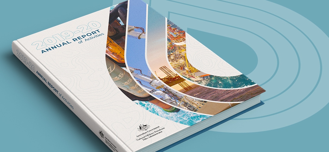
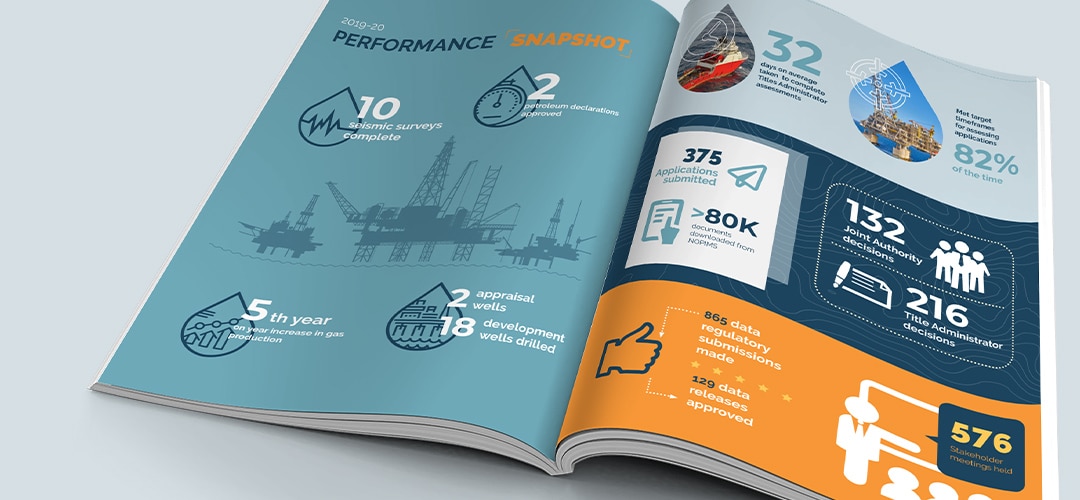
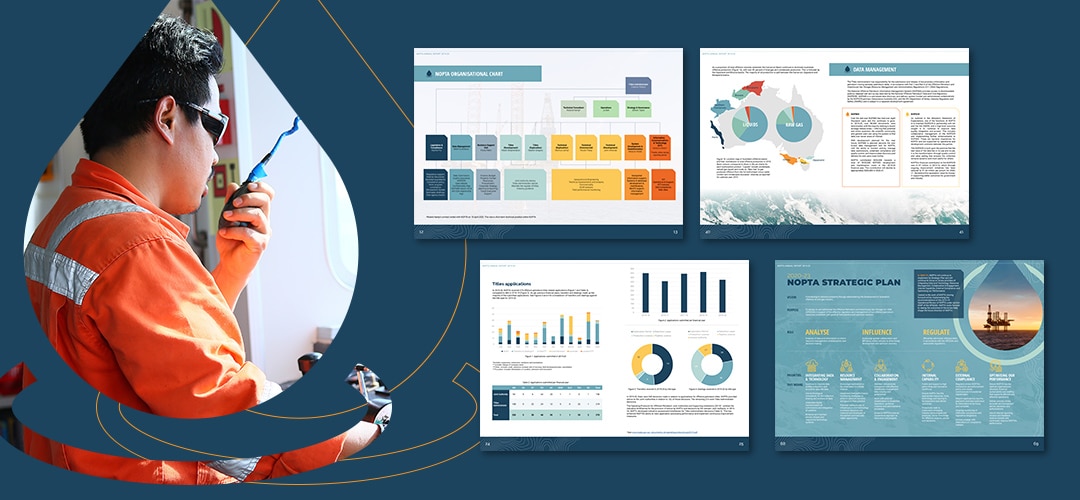
Noop established a fresh and consistent design language utilising a motif derived from seismic survey lines. The design aimed to minimise reader fatigue with the careful selection of typography and balance in layout variation. The NOPTA colours were refined to provide a more bold and contemporary feel. Due to the large amount of content and information presented, a tight visual hierarchy was developed to ease the reading experience for readers, guiding them through what’s next page to page, conveying data in a crisp infographical style. Utilisation of infographics was twofold, to visually present key data as well as assisting with analysis or interpretation for the user, summarising key takeaways. The combination of these elements further minimised perceived visual weight giving a potentially content dense document a very easy and readable feel.

In addition to technical design execution, from a marketing perspective we aimed to create a more real connection to the NOPTA brand, in line with the their commitment to fact and transparency. We sought to utilise data as the highlights of the NOPTA story. Leveraging the power of emotional connection through a combination of quantitative and qualitative storytelling.
Noop managed the complete design process, delivering physical bound printed assets as well as a web optimised PDF version with interactive tabs.
