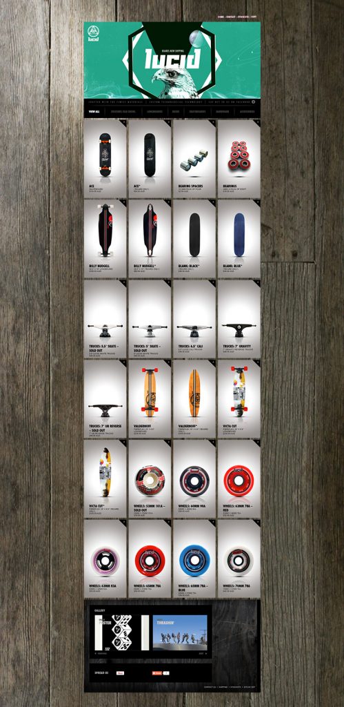
Lucid Skate | A Killer Web Design Showcase
Lucid Skate is a Sydney based skateboard company, who sell all things skateboards, from skateboards and long board to decks and hardware, Lucid Skate is Sydney’s skateboard one stop shop. Alongside specialising in all things skateboards, Lucid Skate have a strong focus in the graphic, visual aspect of their brand, and their website lucidskate.com.au proves this. It is evident by just having a quick glance at the website that a big focus was put into the website design and development, and ensuring this website design matched the overall theme and aesthetic of the brand.
Lucid Skate recently received an honorable mention from awwwards.com, for their web design. Awwwards.com is a website dedicated to evaluating the talent and effort website developers and designers put into their work. Awwwards.com acknowledges the challenging job that is web design and development, and the immense knowledge and experience required to be a successful web designer. Awwwards.com offers various awards to their nominees, awards including, mobile excellence, honorable mention, site of the day, developer award, site of the month and the site of the year award.

Lucid Skate
The awwwards website rates websites based on a four step evaluation system, design, usability, creativity and content, and is evaluated based on approved voters who have knowledge and experience in web design and web development. Voters, also known as the Awwwards Jury, are passed through a validation system, ensuring the credibility of this jury.
Awwwards.com are aware of the importance of web design, so why is it important to invest into web design and development?
There are various factors to a website that create a good website, and ensure optimal performance of the website. These factors are the factors that awwwards.com bases their evaluation system off of, design, usability, creativity and content.
The design aspect, which makes up 40% of the evaluation system, is everything to do with the visual, graphic design aspects of the website. This includes the layout of the website, the colours used, the images/graphics used, the fonts used etc. This design should be visually appealing to the user, and match the target audience it is meant for.
The usability aspect, which makes up 30% of the evaluation system, is everything to do with the performance of the website. This includes the speed, ease of use and layout of the website. A website must be some what easy to use, in order to be successful to all users of the target audience.
The creativity aspect, which makes up 20% of the evaluation system, is everything to do with the overall innovativeness of the website. This includes being unique, different to the competition, and doing something that has not been done before. It’s easy to get lost in a crowded industry, so being creative is important to success.

The content aspect, which makes up 10% of the evaluation system, is everything to do with the content posted onto the website. This includes what content is posted, how frequently this is posted, and how relevant this content is, based on the target audience. A website must have relevant content, that both intrigues and provides a sense of value to the user.
The four aspects, design, usability, creative and content, successfully used together are the steps to a good performing, efficient website.
Here at Noop, we are Perth’s leading intelligent Web Design Agency. We build conversion focused websites that excite, intrigue and compel. With our refined process and website design formula, we ensure a successful high performing, SEO optimised website built for growth.


